Well we're finally finished with the MyOutdoors.net redesign and both of us are really happy with it. Things turned out better than we expected, we're especially happy with a much smoother user experience than we previously had. We spent a lot of time on the actual design, eliminating the unnecessary parts of the site and emphasizing the important ones. In the end, there were a lot of things that we learned about designing a site for a community. In this post, we'll try to share our experiences with everyone.
There is one point in particular that trumps all of the others: It's not just about the idea. We had a pretty good idea. We had no traffic. We might have been Web 1.5.
We think that MyOutdoors.net is different from the other mapping sites we know of because it lets you create a journal of your outdoor activities, including custom HTML layout. A lot of mashups like gmaps-pedometer only let you create a map. MyOutdoors.net also has a much wider audience than others. There are some travel sites out there that do similar things too, but they're very travel oriented and, well, we like the outdoors. There just isn't anything quite like it. We at least thought that we had a good idea.
It turns out that implementation and design are pretty important as well. Together, these two things are what killed our site. The old implementation made it possible for a user to create a journal entry and share it with people; we at least accomplished that much. There were lots of problems though. It wasn't easy to create a map because you had to create a user first. If the map had too many waypoints things got slow. The site didn't look good on smaller displays. Browsing journal entries was difficult. The list goes on... We learned a lot from the first implementation of the site. We had some great feedback from friends and a lot of the bloggers we contacted. Here are five more lessons that you might want to think about for your Web 2.0 site:
K.I.S.S.
Keep it Simple, Smartypants. Google should have taught us this much. You see it everywhere. “But we have so much to show them,” I argued. My brother (Brian that is, I'm Dale) said there was too much going on. He was right. I wanted to display the top journal entries, the recent journal entries, the watch list, a blurb about the site, the comments, and I wanted a pretty header to cap it all off. I thought I could do it all. It was just too much. This brings me to the next point:
Popularity is King.
It's true. You wanted to be on prom court, don't deny it. You also want your blog entry on Digg's front page, you want Alexa rankings, and you want Technorati recognition. Hopefully, you'll also want your journal entry in our Top 10. So that's all we put on the front page, plus a button or two to easily navigate the top journal entries. We also stuck some advertising in there; we want to make some money after all.
Focus on Content
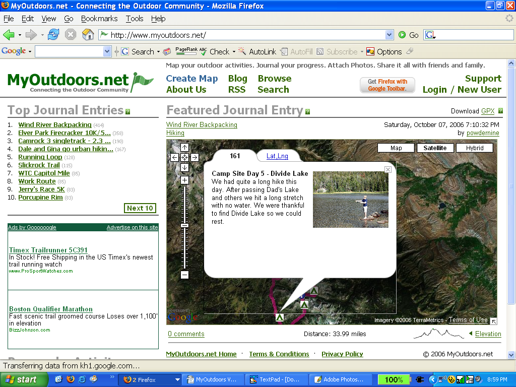
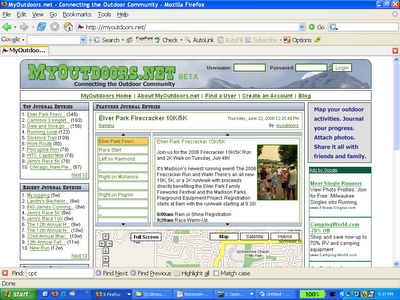
The map is the most important thing, but where was it? You could barely see anything. And if you could, you couldn't see anything else. There just isn't enough room to put everything and our site probably looks like some other mapping mashups now because of it. We had to maximize the area used for content so we shrunk our logo and moved things out to secondary pages that didn't need to be on the front page. There's also a separate page for the journal entry where you can see everything now. Check out Version 1 versus Version 2 below (please excuse the formatting, we're having issues with Blogger...). You'll see that nothing looks the way it used to.
|
|
|
Version 1 |
|
Version 2 |
Make it Easy
We made an attempt to do this the first time, but we failed pretty miserably. The biggest change we made was so that someone could play around with the site without creating an account. Now, there's a big link sticking out on every page that says “Create a Map.” Our hope is that people will see it and play around with the site when they get there.
We also tried to streamline the entire experience, from when a user came to the site to when they created and saved a journal entry. This included the process of actually creating a map. First, we had to make sure a user could get to the location on the map that he or she was looking for. To do this, we added geocoding to find a particular city or address and a navigation mode that lets you double click to zoom in on a particular point. Second, we had to make it easy to add, delete, and insert points so new interaction modes were added for each of these. Lastly, we had to make the account creation process as non-invasive as possible. Now, all we ask for is your email (which we only intend on using for abuse notification), a username, and a password. All of this was important because we had to make it easy for people to use the site, or they came and poked around, were unimpressed, and left.
Don't Forget Engineering
 Web 2.0 still needs software engineering. For you geeks out there, I'll refer you to Dr. Brooks' collection of essays called The Mythical Man Month. There are two very important essays that apply here: “Plan to Throw One Away” and “The Second System Effect.” I think that they go together very well. “Plan to Throw One Away” basically says that the first implementation is always wrong; you need to throw it away and start over. “The Second System Effect” says that the second system an engineer designs is always the most dangerous due to over-engineering. We really wanted to add some more things to the site but we tried to hold back and do this release correctly. The result is a ground-up rewrite including only those features that we thought we needed to include to make the site successful (for example, we took out the watch list, we'll add it back in when we figure out the best place for it). By the way, every essay in the book is worth reading.
There's also a mantra out there about reinventing the wheel. We tried to do a bunch of that originally as well. We wrote our own dialog class for example. There was a lot that we shouldn't have tried to do. The new version of MyOutdoors.net uses the Yahoo UI library. It's really easy so don't try doing it all yourself.
Conclusion
I'm sure there are other things that deserve to be mentioned about designing for Web 2.0. I'm not going to claim that this is it but those are the things that we thought were really interesting when we went back and looked at what went wrong. I think everyone should think about how Web 2.0 really is different though. I don't think it's just another fad. I see Web 2.0 as the re-integration of the community into technology. In the beginning, the construction of the Internet was the creation of a community. As it progressed, a lot of that was lost and I see Web 2.0 as regaining something that has long been forgotten. I hope that the current trend in big business grasping at every community site out there doesn't lose that along the way. That's just my opinion though.
Anyway, we really hope you like the new site. If you have any suggestions, please let us know and we'll do everything we can to incorporate them (in a reasonable way :) ).
 The link will take you to the location search page to display all of the journal entries that are close by. It currently uses a default search radius of 150 miles (apologies to all you metric folks out there). It's kind a wide range, but we thought that you would want to see something rather than nothing, and for journal entries out in the middle of nowhere, it could be useful. Also, they're sorted by distance so the closest ones show up first. Once you're on the search page, you can change the search radius, or enter new search criteria.